07_ResponsiveDesign
Code-Dateien
| Dateiname | Aktion |
|---|---|
| CODECode_ResponsiveDesign.zip | Download |
Videos
| Dateiname | Aktion |
|---|---|
| VIDEOVideo_ResponsiveDesign_D | Abspielen |
Lernmaterialien
Responsive Design
Responsive Design means that a website automatically adapts to different screen sizes and devices — whether it’s a smartphone, tablet, laptop, or desktop computer.
💡 A “responsive” site responds to the device it is viewed on.
📱 1. Why do we need responsive design?
Today, people access websites from many devices:
Smartphones 📱
Tablets 📱
Laptops 💻
Desktop monitors 🖥️
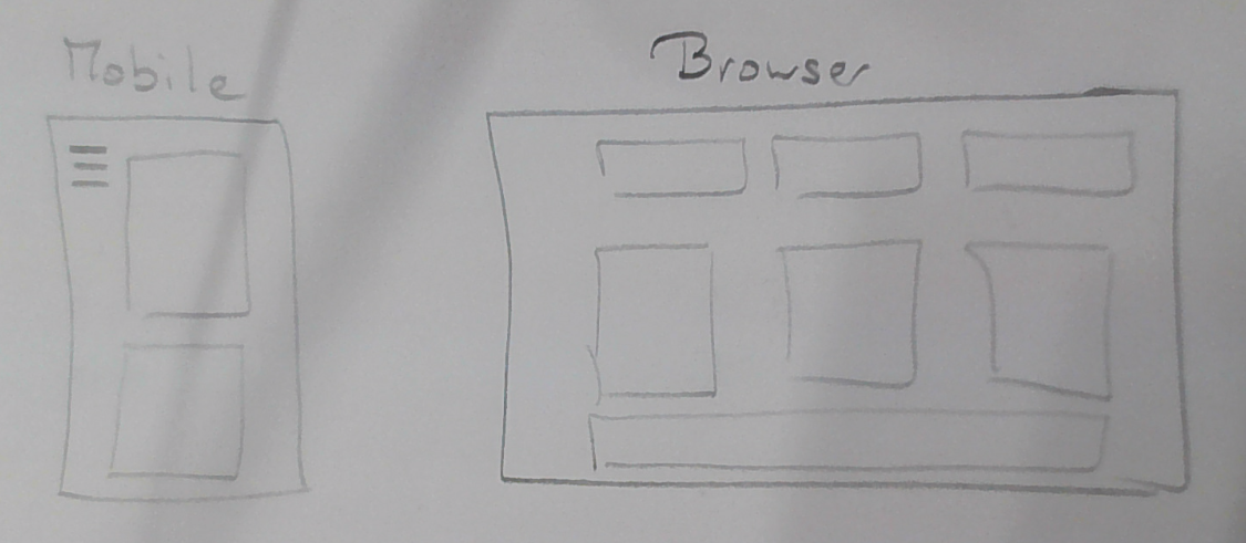
If a website is too small, too wide, or hard to read on a phone, visitors will leave immediately.
Responsive Design fixes this by making sure the layout adjusts itself so the page stays readable and usable on all screens.
🧩 2. Key features of responsive design
| Feature | Description |
|---|---|
| Flexible widths | Elements scale with the screen size (e.g., using percentages instead of fixed pixels). |
| Images resize automatically | Images shrink or grow using max-width: 100%. |
| Readable text | Font sizes adjust to work on small screens. |
| Media Queries | Special CSS rules that apply only to certain screen widths. |
| Column layouts become single-column | On mobile, multi-column layouts become stacked. |
🎨 3. Simple example
📄 HTML
<!DOCTYPE html>
<html lang="en">
<head>
    <meta charset="UTF-8">
    <meta name="viewport" content="width=device-width, initial-scale=1.0">
    <title>Document</title>
</head>
<body>
    <div class="container">
        <div class="box">Box 1</div>
        <div class="box">Box 2</div>
        <div class="box">Box 3</div>
    </div>
</body>
</html>
🎨 CSS
.container {
  display: flex;
  gap: 10px;
}

.box {
  background-color: #0078d7;
  color: white;
  padding: 20px;
  flex: 1;
  text-align: center;
}

/* --- Responsive part --- */
@media (max-width: 600px) {
  .container {
    flex-direction: column; /* Stack boxes vertically on small screens */
  }
}
🧠 What happens:
On a large screen, the boxes appear side by side.
On a phone, they are stacked under each other.
This makes the page look good everywhere.
⚙️ 4. Important CSS tools for responsive design
| Technique | What it does |
|---|---|
@media |
Creates media queries for specific screen sizes |
flex / grid |
Flexible layout systems |
max-width: 100% |
Makes images shrink instead of overflowing |
meta viewport |
Ensures the layout scales correctly on mobile |
Important HTML tag for responsiveness:
<meta name="viewport" content="width=device-width, initial-scale=1.0">Without this, mobile devices zoom out and the layout breaks.
🧠 5. Example: Responsive text and image
img {
  max-width: 100%;
  height: auto;
}

p {
  font-size: 1rem;
}

@media (max-width: 600px) {
  p {
    font-size: 0.9rem; /* slightly smaller text for narrow devices */
  }
}
This keeps images and text readable on all devices.
✅ 6. Summary
| Concept | Meaning |
|---|---|
| Responsive Design | A website adapts to any device automatically |
| Goal | Easy to read and use everywhere |
| Tools | Flexbox, Grid, Media Queries, fluid sizes |
| Required tag | <meta name="viewport"> for mobile
optimization |
💬 In simple words:
Responsive Design means a website looks good and works well on every device, from phone to desktop.
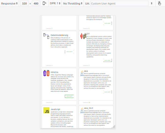
Show your students the Responsive Design Mode in the
browser:
Chrome DevTools → Ctrl+Shift+I → Toggle device
toolbar.
They’ll instantly see how their page changes on different screen
widths.
Absolutely — here is a clear, student-friendly
explanation of Flexbox, Grid,
and Responsive Design, each with its own HTML +
CSS example.
Perfect for teaching or practicing at home.
🎯 1. Flexbox — One-Dimensional Layout (Row OR Column)
🚀 What Flexbox does
Flexbox helps you arrange items in a row or a column and control:
spacing
alignment
size
order
It is called one-dimensional because it works in one
direction at a time:
➡ either horizontally (row) or vertically
(column).
📄 Flexbox Example (HTML + CSS)
flexbox.html
<!DOCTYPE html>
<html lang="en">
<head>
<meta charset="UTF-8">
<meta name="viewport" content="width=device-width, initial-scale=1.0">
<title>Flexbox Example</title>
<style>
  .flex-container {
    display: flex;             /* activate Flexbox */
    gap: 20px;                 /* space between boxes */
    background: #f0f0f0;
    padding: 20px;
  }

  .box {
    flex: 1;                   /* all boxes share space equally */
    background: #0078d7;
    color: white;
    padding: 20px;
    text-align: center;
    border-radius: 10px;
    font-size: 1.2rem;
  }
</style>
</head>
<body>

<h1>Flexbox Example</h1>

<div class="flex-container">
  <div class="box">Box 1</div>
  <div class="box">Box 2</div>
  <div class="box">Box 3</div>
</div>

</body>
</html>
✔ What students learn:
display: flexgaphorizontal alignment
equal-width items (
flex: 1)
🎯 2. CSS Grid — Two-Dimensional Layout (Rows AND Columns)
🚀 What Grid does
Grid allows you to create rows and columns at the
same time.
It is ideal for:
entire page layouts
photo galleries
dashboards
cards in a grid
It’s two-dimensional because it controls both width and height.
📄 Grid Example (HTML + CSS)
grid.html
<!DOCTYPE html>
<html lang="en">
<head>
<meta charset="UTF-8">
<meta name="viewport" content="width=device-width, initial-scale=1.0">
<title>Grid Example</title>
<style>
  .grid-container {
    display: grid;                               /* activate Grid */
    grid-template-columns: repeat(3, 1fr);       /* 3 equal columns */
    gap: 20px;                                    /* space between items */
    padding: 20px;
  }

  .item {
    background: #0a66c2;
    color: white;
    padding: 30px;
    text-align: center;
    border-radius: 10px;
    font-size: 1.2rem;
  }
</style>
</head>
<body>

<h1>Grid Layout Example</h1>

<div class="grid-container">
  <div class="item">A</div>
  <div class="item">B</div>
  <div class="item">C</div>
  <div class="item">D</div>
  <div class="item">E</div>
  <div class="item">F</div>
</div>

</body>
</html>
✔ What students learn:
display: gridgrid-template-columnsrepeat()automatic layout of multiple items
🎯 3. Responsive Design — Adapt Layout to Any Screen
🚀 What responsive design does
Responsive design ensures your website looks good on all devices:
smartphones
tablets
laptops
desktop screens
It uses flexible layouts + media queries.
Key tools:
%,fr,reminstead of fixed pixelsmax-width: 100%imagesFlexbox / Grid adjust naturally
Media queries change layout at breakpoints
Must include view-port meta tag:
<meta name="viewport" content="width=device-width, initial-scale=1.0">📄 Responsive Example (HTML + CSS)
This example switches from a row layout on
desktop
to a column layout on mobile.
responsive.html
<!DOCTYPE html>
<html lang="en">
<head>
<meta charset="UTF-8">
<meta name="viewport" content="width=device-width, initial-scale=1.0">
<title>Responsive Example</title>
<style>
  .container {
    display: flex;
    gap: 20px;
    padding: 20px;
  }

  .box {
    flex: 1;
    padding: 25px;
    background: #f39c12;
    color: white;
    border-radius: 10px;
    text-align: center;
    font-size: 1.2rem;
  }

  /* --- Responsive breakpoint --- */
  @media (max-width: 600px) {
    .container {
      flex-direction: column; /* mobile view: stacked boxes */
    }
  }
</style>
</head>
<body>

<h1>Responsive Layout Example</h1>
<p>Resize the browser window or open this on your phone.</p>

<div class="container">
  <div class="box">Content A</div>
  <div class="box">Content B</div>
  <div class="box">Content C</div>
</div>

</body>
</html>
✔ What students learn:
What a breakpoint is
How layouts change at small widths
Why Flexbox makes responsive layouts easy
🧠 SUMMARY TABLE
| Concept | Type | Best For | Layout Direction | Student Difficulty |
|---|---|---|---|---|
| Flexbox | 1D layout | Nav bars, card rows | Row or column | Easy |
| Grid | 2D layout | Full page layouts, galleries | Rows + columns | Medium |
| Responsive Design | Adaptive layout | Works on all devices | Any | Conceptual |
Bootstrap
Bootstrap is a popular CSS framework that helps you build modern, responsive websites quickly without writing all the CSS yourself.
Think of Bootstrap as:
“A big toolbox full of ready-made design pieces.”
Bootstrap provides:
pre-styled buttons
navigation bars
responsive grids
forms
spacing utilities
colors & typography
…and much more.
You include Bootstrap once, and then you can build pages using its ready-made classes.
💡 Why use Bootstrap?
✔ Very fast to build layouts
✔ Works on all screen sizes automatically
✔ Great for beginners & teaching
✔ Many components ready to use (navbars, cards, forms…)
✔ Based on Flexbox & Grid
Bootstrap basically saves you from writing a lot of CSS manually.
🧱 1. Getting Started — Include Bootstrap
Add this inside the <head> of your HTML:
<link
  rel="stylesheet"
  href="https://cdn.jsdelivr.net/npm/bootstrap@5.3.0/dist/css/bootstrap.min.css">
Now Bootstrap is ready to use.
🎨 2. Bootstrap Buttons (Example)
📄 HTML Example
<!DOCTYPE html>
<html lang="en">
<head>
<meta charset="UTF-8">
<link
  rel="stylesheet"
  href="https://cdn.jsdelivr.net/npm/bootstrap@5.3.0/dist/css/bootstrap.min.css">
<title>Bootstrap Buttons</title>
</head>
<body class="p-4">

<h1>Bootstrap Buttons</h1>

<button class="btn btn-primary">Primary Button</button>
<button class="btn btn-success">Success Button</button>
<button class="btn btn-danger">Danger Button</button>

</body>
</html>
✔ No CSS needed
✔ Buttons look modern
✔ Many ready-made color styles
🧱 3. Bootstrap Grid (Responsive Layout)
Bootstrap uses a 12-column grid system.
📄 HTML Example
<!DOCTYPE html>
<html lang="en">
<head>
<meta charset="UTF-8">
<link
  rel="stylesheet"
  href="https://cdn.jsdelivr.net/npm/bootstrap@5.3.0/dist/css/bootstrap.min.css">
<title>Bootstrap Grid</title>
</head>
<body class="p-4">

<h1>Bootstrap Grid Example</h1>

<div class="container">
  <div class="row">
    <div class="col-md-4 bg-primary text-white p-3">Column 1</div>
    <div class="col-md-4 bg-warning p-3">Column 2</div>
    <div class="col-md-4 bg-success text-white p-3">Column 3</div>
  </div>
</div>

</body>
</html>
✔ On desktop → 3 equal columns
✔ On mobile → columns stack automatically
This is built-in responsive design.
🎨 4. Bootstrap Card Component
Cards are a common UI element.
📄 HTML Example
<!DOCTYPE html>
<html lang="en">
<head>
<meta charset="UTF-8">
<link
  rel="stylesheet"
  href="https://cdn.jsdelivr.net/npm/bootstrap@5.3.0/dist/css/bootstrap.min.css">
<title>Bootstrap Cards</title>
</head>
<body class="p-4">

<h1>Bootstrap Card Example</h1>

<div class="card" style="width: 18rem;">
  <img src="https://via.placeholder.com/300" class="card-img-top" alt="image">
  <div class="card-body">
    <h5 class="card-title">My Card</h5>
    <p class="card-text">Bootstrap makes card layouts very easy.</p>
    <a href="#" class="btn btn-primary">Read More</a>
  </div>
</div>

</body>
</html>
✔ Ready-made structure
✔ Automatically responsive
✔ Great for content blocks, profiles, etc.
🧱 5. Bootstrap Navbar (Simple Example)
📄 HTML Example
<!DOCTYPE html>
<html lang="en">
<head>
<meta charset="UTF-8">

<link
  rel="stylesheet"
  href="https://cdn.jsdelivr.net/npm/bootstrap@5.3.0/dist/css/bootstrap.min.css">

<title>Bootstrap Navbar</title>
</head>
<body>

<nav class="navbar navbar-expand-lg navbar-dark bg-dark">
  <div class="container">
    <a class="navbar-brand" href="#">My Site</a>

    <div class="navbar-nav">
      <a class="nav-link" href="#">Home</a>
      <a class="nav-link" href="#">About</a>
      <a class="nav-link" href="#">Contact</a>
    </div>
  </div>
</nav>

</body>
</html>
✔ Ready-made navigation
✔ Automatically collapses on mobile
🧠 Bootstrap vs. Flexbox & Grid
| Topic | Bootstrap | Flexbox / Grid |
|---|---|---|
| Speed | Very fast | Requires coding CSS |
| Design | Pre-made | Fully custom |
| Learning | Easy | More technical |
| Control | Limited (pre-styled) | Total control |
| Responsive | Built-in | Must use media queries |
👉 Bootstrap uses Flexbox and Grid internally
So learning Flexbox + Grid first makes Bootstrap easier.
Here is a clear, beginner-friendly explanation of Tailwind
CSS, with simple examples you can use in
class.
Tailwind is very different from Bootstrap, so this should help students
understand the new approach.
🎯 What Is Tailwind CSS?
Tailwind CSS is a utility-first CSS
framework.
Instead of giving you pre-styled components (like Bootstrap), Tailwind
gives you small utility classes that you combine to
build your own designs.
Think of Tailwind as:
“A huge collection of tiny building blocks you use directly in HTML.”
Examples of Tailwind utility classes:
bg-blue-500→ blue backgroundtext-white→ white textp-4→ paddingrounded-lg→ large border radiusflex→ activate Flexboxgrid→ activate Grid
Tailwind is:
fast
very customizable
extremely popular today
perfect for building modern designs quickly
📦 1. How to include Tailwind (CDN version)
For teaching, the easiest way is using the CDN version (no installation needed):
<script src="https://cdn.tailwindcss.com"></script>Add it inside the <head>.
🎨 2. Simple Tailwind Example — A Styled Button
📄 HTML Example
<!DOCTYPE html>
<html lang="en">
<head>
<meta charset="UTF-8">
<script src="https://cdn.tailwindcss.com"></script>
<title>Tailwind Button</title>
</head>
<body class="p-6">

<h1 class="text-2xl font-bold mb-4">Tailwind Button</h1>

<button class="bg-blue-500 text-white px-4 py-2 rounded-lg hover:bg-blue-600">
  Click Me
</button>

</body>
</html>
✔ No CSS file
✔ Styles directly in HTML
✔ Hover effect included
🧱 3. Tailwind Flexbox Example
Tailwind uses utilities like flex, gap-4,
justify-center.
📄 HTML Example
<!DOCTYPE html>
<html lang="en">
<head>
<meta charset="UTF-8">
<script src="https://cdn.tailwindcss.com"></script>
<title>Tailwind Flexbox</title>
</head>
<body class="p-6">

<h1 class="text-2xl font-bold mb-4">Tailwind Flexbox Example</h1>

<div class="flex gap-4">
  <div class="flex-1 bg-blue-500 text-white p-4 rounded-lg">Box 1</div>
  <div class="flex-1 bg-green-500 text-white p-4 rounded-lg">Box 2</div>
  <div class="flex-1 bg-purple-500 text-white p-4 rounded-lg">Box 3</div>
</div>

</body>
</html>
✔ No custom CSS needed
✔ Easy Flexbox layout
✔ Equal-width boxes using flex-1
🧩 4. Tailwind Grid Example
📄 HTML Example
<!DOCTYPE html>
<html lang="en">
<head>
<meta charset="UTF-8">
<script src="https://cdn.tailwindcss.com"></script>
<title>Tailwind Grid</title>
</head>
<body class="p-6">

<h1 class="text-2xl font-bold mb-4">Tailwind Grid Example</h1>

<div class="grid grid-cols-3 gap-4">
  <div class="bg-red-500 text-white p-4 rounded-lg">A</div>
  <div class="bg-blue-500 text-white p-4 rounded-lg">B</div>
  <div class="bg-green-500 text-white p-4 rounded-lg">C</div>
  <div class="bg-yellow-500 text-white p-4 rounded-lg">D</div>
  <div class="bg-purple-500 text-white p-4 rounded-lg">E</div>
  <div class="bg-pink-500 text-white p-4 rounded-lg">F</div>
</div>

</body>
</html>
✔ A full Grid layout in one line
✔ No CSS file
✔ Extremely flexible
📱 5. Tailwind Responsive Design Example
Tailwind has built-in responsive prefixes:
| Prefix | Meaning |
|---|---|
sm: |
small screens (≥640px) |
md: |
medium screens (≥768px) |
lg: |
large screens (≥1024px) |
📄 HTML Example
<!DOCTYPE html>
<html lang="en">
<head>
<meta charset="UTF-8">
<script src="https://cdn.tailwindcss.com"></script>
<title>Tailwind Responsive</title>
</head>
<body class="p-6">

<h1 class="text-2xl font-bold mb-4">Tailwind Responsive Example</h1>

<div class="grid grid-cols-1 sm:grid-cols-2 lg:grid-cols-3 gap-4">
  <div class="bg-blue-500 text-white p-4 rounded-lg">Box 1</div>
  <div class="bg-green-500 text-white p-4 rounded-lg">Box 2</div>
  <div class="bg-purple-500 text-white p-4 rounded-lg">Box 3</div>
</div>

</body>
</html>
✔ 1 column on phones
✔ 2 columns on tablets
✔ 3 columns on desktops
Tailwind makes responsive design very easy.
🧠 Bootstrap vs. Tailwind (Quick Comparison)
| Feature | Bootstrap | Tailwind |
|---|---|---|
| Style | Pre-designed | Build your own |
| Customization | Medium | Very high |
| Learning Curve | Easier at first | Takes time |
| HTML Size | Smaller | Larger (many classes) |
| Modern design | Requires overrides | Built-in modern look |
| Speed | Fast | Very fast |
Summary:
Bootstrap = pre-styled components
Tailwind = utility building blocks to create your own design